Microsoft and Apple have a long history of being engaged in a hard-fought rivalry. Each company has at times managed searing coups and suffered ignominious defeats. Both have forced the other to adapt in order to compete. It’s no revelation that Apple has been in the lead lately, pushing Microsoft to delve into the hardware and mobile markets.

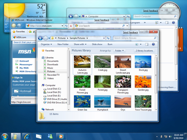
One interesting segment where Microsoft was a leader but became a follower was their new OS shift. Windows 7 was a beautiful and capable operating system. It featured high levels of transparency that really evoked images of its namesake but the transition to Windows 8 stripped all of that away.

I’ve spoken with Windows 8 developers who thought that translucency is overused and cheesy. Windows 8 is all about sharp corners and flat colors and, while it does result in a pleasing aesthetic, I think it is clear that the harsh criticism of Windows 7 was overblown. The truth of it is that single layers are easier on mobile batteries.

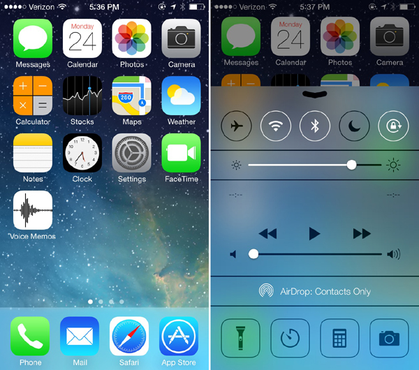
Now, surprise, surprise, Apple releases iOS 7 and one of its most visible changes is the heavy emphasis on transparency in the UI. In a bid to stand out, Apple grabbed what Microsoft dropped.
But then, this is Apple’s strength. They took the notification pane from Android. Their multitask interface steals from the underrated WebOS. The new picture organization borrows heavily from newer Samsung devices. All in all, they take the best elements of what is already out there and deliver something that even the jail breakers can’t complain about.
Well, that last part might need to wait until Apple officially allows icon customization.